AFT Blog
Getting the Perfect Picture – Graph Formatting Options
Previously, we talked about the Graph Guide, creating Stacked graphs and Dual-Y graphs, and visualizing the results using Animated graphs. This final installment will focus on the various ways to format graphs so they are exactly how you want them to look.
In general, there are several ways to set the formatting for the various parts and regions of a graph. I will start with the model we made in the previous blog – the AFT Impulse model, ‘Pump Startup With Event Transient.imp’, which is installed in the Examples folder.
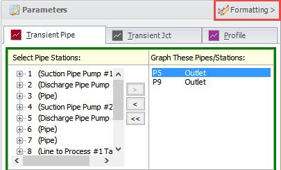
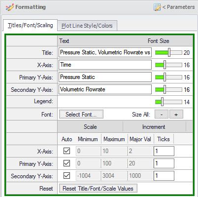
Many of the formatting options are gathered together on the Formatting slide panel on the Graph Control tab of the Quick Access Panel. Click on the ‘Formatting >’ button area and a panel with two tabs will slide over the parameter definition area.
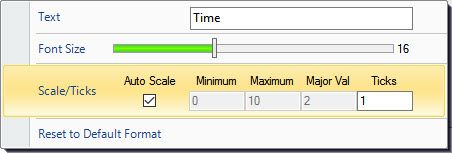
There are alternate ways to set the formatting. One way is to right-click on the item. For example, if you right-click on the X-axis, a menu will pop up where you can set items.
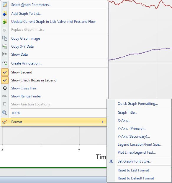
Another way to get to the formatting option is to right-click on the graph, select Format, then select the item to change. Finally, it is also available on the Graph window toolbar.
Title and Fonts
While using any of the previously mentioned methods, you can enter text for the title and axes. To change the font size, move the slider left (for smaller) or right (for larger). The graph will update as you make these changes so you can immediately see what it will look like.
On the Formatting panel, you can also change the font size of all text at once by clicking on the ‘-‘ or ‘+’ buttons. Next to this is the ‘Select Font…’ button which will allow you to choose the font you want to use.
![]()
Line Colors
You can change the color, thickness and style of each of the plot lines. On the Formatting panel, select the ‘Plot Line Style/Colors’ tab. From the menu items, select ‘Plot Lines/Legend Text’. To select the color, click on the color rectangle and then select a new color.
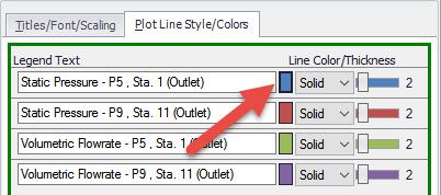
To change the thickness of the line, move the slider left or right. Drop down the list to select the line style. The default style is a solid line for most types of graphs. You can also change the sizes and styles of all the lines using the controls near the bottom of the window. The Reset button will change everything back to the settings used when the graph was added to the Graph List. The Default button will set everything to the application defaults.

Legend
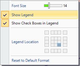
The legend text can be changed on the same window where the line color/style is set (shown above). Other options can be found by selecting ‘Legend Location/Font Size…’ from one of the graph menu items.
You can move the legend around by clicking and dragging it to several, pre-set locations. You can also select the location on the menu grid.
If the checkboxes are shown, you can choose to hide a plot line by unchecking the box. This is a quick way to see a particular data line if there are several being shown.
Axis Scale
The axis scale is automatic by default – which is indicated by the check under Auto Scale. Uncheck this and you will be able to set the minimum and maximum value, the major increment value and the number of tick marks between the major value lines. Rechecking the Auto Scale box will reset these values.

Annotations
Annotation can be added to the graph in several ways. If, for example, I wanted to call attention to a particular point or area, I could put an annotation on the graph and enter an explanation. You can select the ‘Create Annotation…’ from the Graph window menu or by right-clicking on the graph.
The Edit Annotation window is displayed where you can enter the text you want to display. You can change the font, color, border thickness, etc. For this example, I want to call out a particular area of the graph so I selected the connector style to be an Arrow.
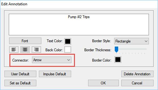
Once you click OK, the annotation will place on the graph. You can drag it to move it to the location you desire. I find it easier to first locate where the point of the arrow is (the yellow circle handle), then move the text in the box.
Defaults
Once you have a style (colors, fonts, etc.) you like for your graphs, you can click ‘Set as Default’ at the bottom of the Graph Control tab and this will save your changes for future graphs. You can apply this style to a graph by clicking ‘User Default’.
Conclusion
As you can see, you have great control over what you can format to make your graph just the way you would like. There are also many ways to access the formatting controls. As you explore all the powerful graphing features, you will find the style and usage you prefer to quickly and easily display, and understand the results of your models. Have fun exploring and learning the new graphing features in Applied Flow Technology applications.
Additional Graph Guide information can be found here:
Now For Something Completely Different: The New Graph Guide in AFT Impulse 6
What Would You Like to Do? – Exploring the New Graph Guide
Things Are Really Stacking Up - Creating Stacked Graphs
Seeing Double – Using Dual Y-Axis Graphs
The World in Motion - Understanding Results Through Animated Graphs



Comments