AFT Blog
Things Are Really Stacking Up – Creating Stacked Graphs
Using graphs that are stacked on top of each other is a great way to see the variation of several parameters at once and how one interacts with the others. There are several ways to create stacked graphs using the new graphing features in AFT applications, which I will cover here.
I am going to start with the AFT Impulse model, ‘Pump Startup With Event Transient.imp’, which is installed in the Examples folder. I am going to use the ‘One Pump Start With One Running’ scenario. We will first compare the flow and pressure in the pipe path from the Supply Reservoir (J1), through Transfer Pump #1 (J2), to the Process Tank #2 (J11) as the other pump starts up.
After running the model, click the Graph Results button and the Graph Guide will appear. You can see my previous blog for an overview of the Graph Guide. Since this is going to be a plot along a pipe path, the Profile type will be most applicable. The Graph Guide can point out the steps to take to make the profile plot we want. In the Guide, click Advanced, then Profile and finally Stacked Graph.
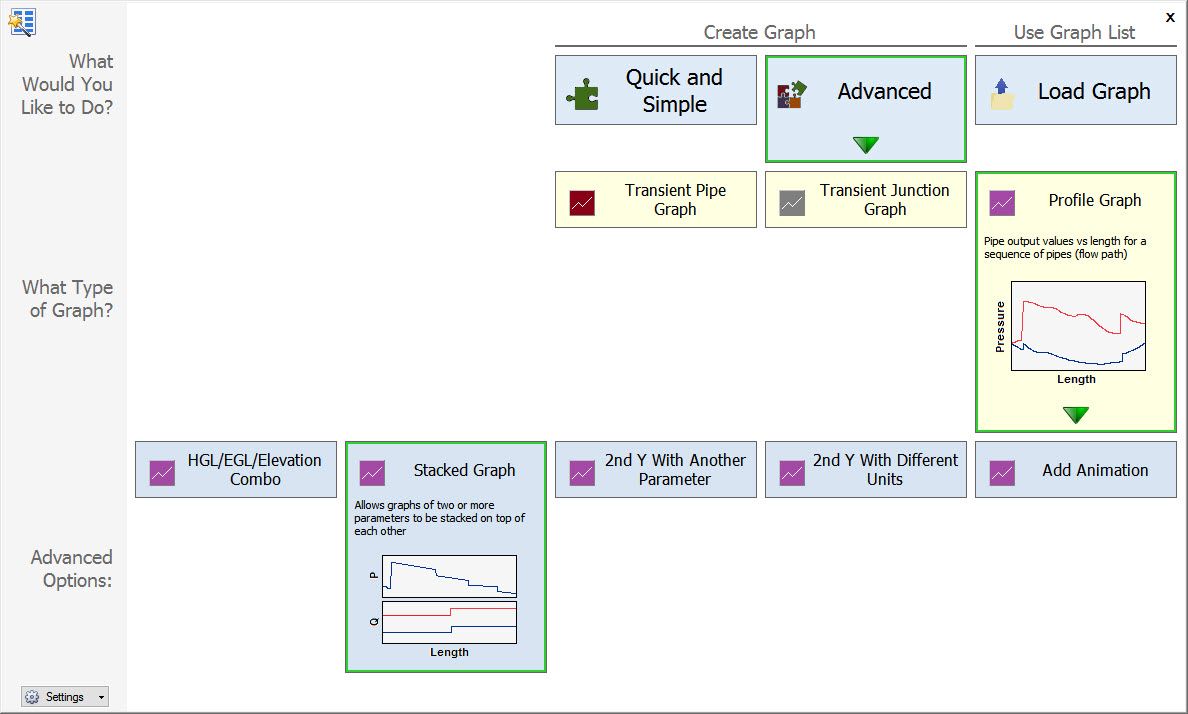
This will bring up three Direction Bubbles showing the steps to take to make a stacked graph. The first step is to select the pipes to be included in the profile. In the case we are examining, we need the following pipes: P1, P2, P3, P7, and P11. Select these by clicking the check box next to each one. Other ways to choose these pipes are to pre-select them on the Workspace or by clicking Special… and selecting a Group which was previously created.
The next step is to add the parameters that we want to show in the graphs. Initially there is one parameter selected. To add a second, click on the green ‘+ Add’ and a new row will be added to the table of parameters. Then choose Volumetric Flowrate for this second parameter.

The units for each parameter can be changed by dropping down the list and selecting the desired unit. The four columns of check boxes allow the following to be shown on the graph: Mx = Maximum value, Mn = Minimum value, SS = Steady-state value, DA = Design Alert. In this example we will just show the maximum and minimum values.
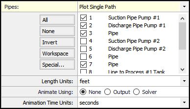
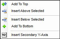
By default, the new parameter is added to the bottom of the list when the ‘+ Add’ button is clicked. If you click on the dropdown arrow on the button, a menu appears which allows you to add the new parameter at the top, or insert it between the selected existing parameter. The selected parameter is indicated by a square or an arrow in the left-hand column.
Existing parameters can be reordered by selecting a parameter to move and clicking on the blue up or down arrows at the top of the parameter list. A parameter can also be removed from the list by clicking ‘X remove’.
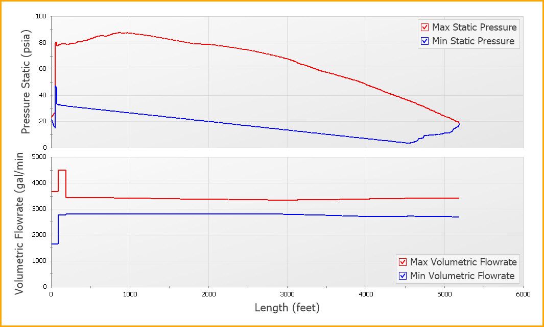
Since we have now defined the parameters we want to show, click the Generate button and the two graphs will be put on the same Graph Tab, stacked, using the same X-axis value for length.
Formatting the Graphs
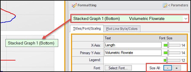
In the above picture, I moved the legend for the top graph up by dragging it to the top right corner. Other formatting can also be done. For example, the default Y-axis text size is a little large for the bottom graph. On the Graph Control tab, click ‘Formatting >’ just above the graph type tabs, to slide the formatting pane over.
Since this is a stacked graph, some formatting, like the font sizes, will be applied to all graphs. You can select which graph is being formatted by using the dropdown list, in green, at the top of the formatting pane. A green box will be placed on the graph for additional clarity. We could move the Y-axis slider to change the font size, but it may be nicer to change the sizes of all the text at once. This is done by clicking the ‘-‘ or ‘+’ buttons in the Size All area.
There are other ways to format the graph. You can right-click on the Y-axis and select the size in the formatting menu. You can also right-click on the graph and select Format from the menu and select the item you want to change.
Now that we have our graph formatted the way we would like, it is a good idea to add it to the Graph List so that it can be reused without having to specify it all over again to show it. To do this, click the Add to Graph List… button on the tool bar. Give it a name, such as ‘Pressure Through Pump #1 to Tank #2‘. This will add the graph to the current folder in the Graph List Manager. Additionally, you will notice that the border around the graphs will change from orange to dark green. If you want to redisplay this graph at some later point, simply double-click on the name in the list.
Creating Stacked Graphs from the Graph List
Another way to generate stacked graphs is to use the Graph List Folders. If all the graph list items in a folder have the same X-axis parameter (e.g. Time or Length), they can be shown as stacked graphs. This allows different types of graphs, like Transient Pipes and Transient Junctions, to be shown together.
The first thing to do is to make a new Graph Folder by clicking on the New Folder… icon on the toolbar in the Graph List Manager. Then give it a name like ‘Time Graphs’.
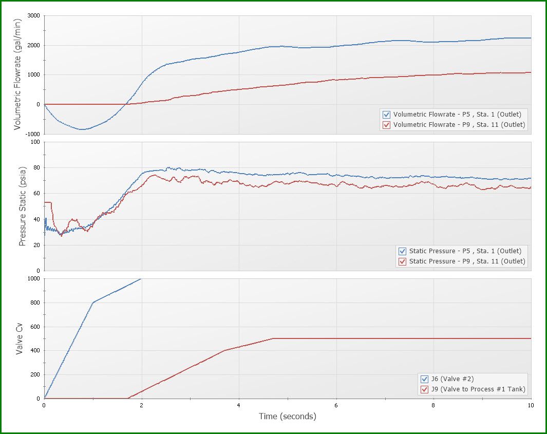
Let’s examine the pressures and flows at the two valves (J6 and J9) which will open during the simulation. The first graph to make is the CV for these two valves. On the Transient Jct graph type tab, add both junction J6 (Valve #2) and J9 (Valve to Process #1 Tank) to the list and choose Valve Cv as the parameter. Generate the graph and then add it to the ‘Time Graphs’ folder.
Create a new Graph Tab by clicking on the green + button at the bottom of the graph window. Then select the Transient Pipe graph type tab. Add pipe P5 Outlet and pipe P9 Outlet to the list of pipe stations. Select Pressure Static as the parameter then click Generate. Add this graph to the ‘Time Graphs’ folder. Repeat this process, but use Volumetric Flowrate as the parameter, and add it to the list.
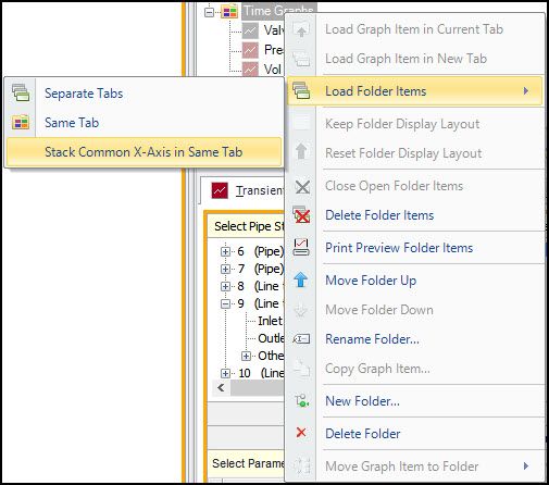
Now there should be three graphs list items under the folder ‘Time Graphs’. Clear all the Graph Tabs by clicking on the yellow lightning bolt and selecting Clear All Tabs. Then right-click on the ‘Time Graphs’ folder in the Graph List Manager and select Load Folder Items and then Stack Common X-Axis in Same Tab.
This will show these three graphs with a common Time axis. The behavior of the system can now be examined as the valves open. The order of the graphs will be what is listed in the folder. These can be reordered by moving the graph list items up or down using the blue up and down arrows.
There are many other tools that are useful when looking at the graphs. The use of the Crosshairs to see the correlations at a specific point in time is very helpful. The graphs can be zoomed in to examine specific time more closely. The data for all the graphs can be displayed and copied to the clipboard for use in Excel and other applications.
I encourage you to explore these features and see how they can help you be more productive in your analysis. I’ll be talking about other new graph features in the coming weeks. Until then, don’t be afraid to see what is available to you, especially with the right-click menus.
Addional Graph Guide information can be found here:
Now For Something Completely Different: The New Graph Guide in AFT Impulse 6
What Would You Like to Do? – Exploring the New Graph Guide
Seeing Double – Using Dual Y-Axis Graphs
The World in Motion - Understanding Results Through Animated Graphs


Comments