AFT Blog
What Would You Like to Do? – Exploring the New Graph Guide
The primary way to view results when using Impulse is through graphical data. With the release of AFT Impulse 6, the power of the graphing features has been greatly increased. With this enhanced capability comes additional complexity. It is a kin to the power and complexity of in-dash radio consoles in modern cars compared to the old stereo in my old Ford Pinto.
To help users navigate the new capabilities of this powerful graphing tool, we have developed a ‘Graph Guide’ which points out the steps to accomplish many of the common tasks in creating, modifying and keeping graphs.
The Graph Guide and these new graphing features have also been incorporated into the latest releases of AFT Fathom and AFT Arrow.
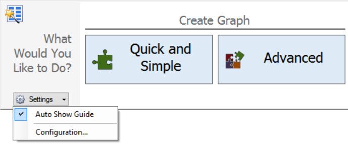
The Graph Guide is automatically shown when you access to the Graph window to help with basic tasks of creating a graph. You can also show or hide the Graph Guide by clicking the What Would You Like to Do? area. Once you have used graphs for a while and are comfortable with the Graph Control, you can stop automatically showing the Graph Guide by clicking on the Settings dropdown button and unchecking the Auto Show Guide option at the top. You always have the option to show the Graph Guide on demand by clicking the What Would You Like to Do? area.
A Graph Guide Walk Through
The Graph Guide is adaptable to the situation you are in. For example, there will be different guide items shown if there is no graph made yet, or if one or more exists already. As you choose a particular selection, additional information is presented based on that choice.
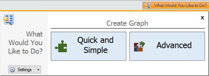
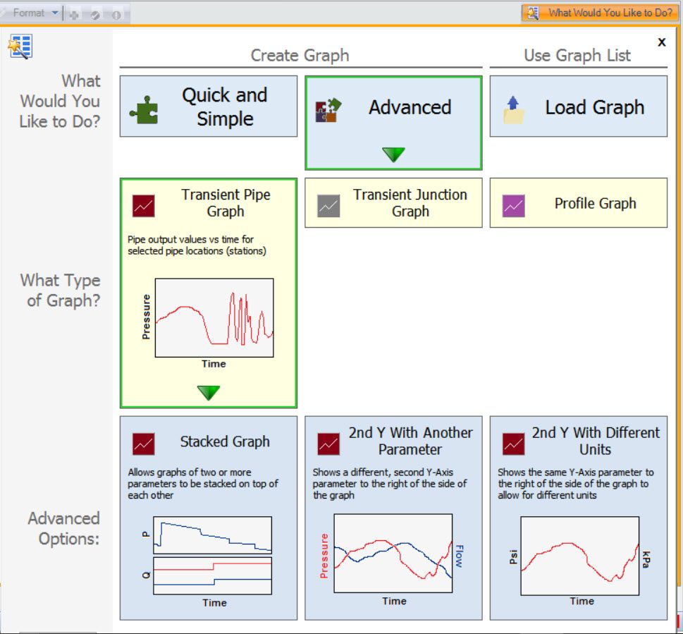
There are up to three rows, or levels, of questions presented. New levels appear as selections are made. In each level there are ‘Tiles’ with common tasks or options to select. The first level establishes a general direction of what you want to do. This level also has the tiles grouped together under broad categories (located at the top) like Create Graph, Modify Graph, etc.
If there are additional options available when you click on a tile, a new row is displayed and a green arrow will indicate which tile was selected. The Tiles also have a short description and representative image for quick association. You can click on other tiles to change your selections.
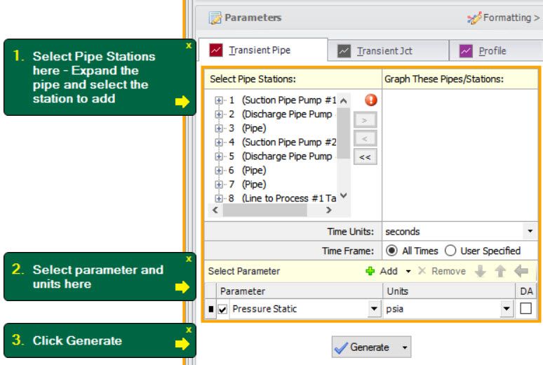
Once you have reached the basic level of a task through selecting the appropriate Tiles, then ‘Direction Bubbles’ are shown. These bubbles give information about each step and point to the control to use. They are numbered to show the order of the tasks. Occasionally, the first task is somewhere other than the Graph Control. For example, a button on the Toolbar at the top or the Graph Tab Bar area at the bottom. You can close each bubble when the step is completed by clicking on the X in the upper corner – though this is not necessary.
Finally, you can customize the colors of the Direction Bubbles. With the Graph Guide open, click on the Settings button in the lower-left corner and select Configuration. The colors for the background, text, and arrows can be selected. These settings can then be saved in your preference file by clicking Set as Default.
Over the next several weeks we will discuss some of the new graphing features in more detail and how to build great graphs (and movies) to understand the model results. For now, have fun exploring the new Graph Guide.
Addional Graph Guide information can be found here:
Now For Something Completely Different: The New Graph Guide in AFT Impulse 6
Things Are Really Stacking Up - Creating Stacked Graphs
Seeing Double – Using Dual Y-Axis Graphs
The World in Motion - Understanding Results Through Animated Graphs



Comments