AFT Blog
Seeing Double – Using Dual Y-Axis Graphs
Previously, we talked about the Graph Guide and how to create Stacked Graphs. Another way to see the interactions between parameters is to show them on one graph with dual Y-axes and a common X-axis scale.
I am going to again start with the AFT Impulse model, ‘Pump Startup With Event Transient.imp’, which is installed in the Examples folder, and use the ‘One Pump Start With One Running’ scenario. In the previous blog, we used a Stacked Graph to examine the pressures and flows at two valves (J6 and J9), which opened during the simulation. This time, we will put them on the same graph, with pressure on the primary Y-axis and flow on the secondary.
After running the model, click the Graph Results button to go to the window and select the Transient Pipe graph-type tab. To view these parameters, we are going to look at the outlet of the pipes just upstream of the two valves. In the Select Pipe Stations area, expand pipe P5 and select Outlet, then expand pipe P9 and select Outlet.
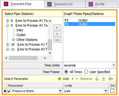
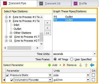
The next step is to add the parameters we want to show in the graphs. Initially, there is one parameter selected. Make sure this is Pressure Static. To add a second, click on the green ‘+ Add’ and a new row will be added to the table of parameters. Then choose Volumetric Flowrate from the dropdown list for the newly added second parameter. The units for each parameter can be changed by dropping down the list and selecting the desired unit.

Now we need to change this from a Stacked Graph to a Dual Y-Axis Graph. This is done by indenting the second parameter to indicate that it is to be shown on the secondary Y-axis. There are two ways to do this. First, select the second parameter (Volumetric Flowrate) and notice that the indicator is a right-pointing triangle. If you double click on that triangle, the parameter will move over and become secondary. The second way is to select the parameter and click on the blue arrow pointing to the right. Note that you can only have one secondary parameter.

The complete definition now looks like this and we can click the Generate button to display the graph.
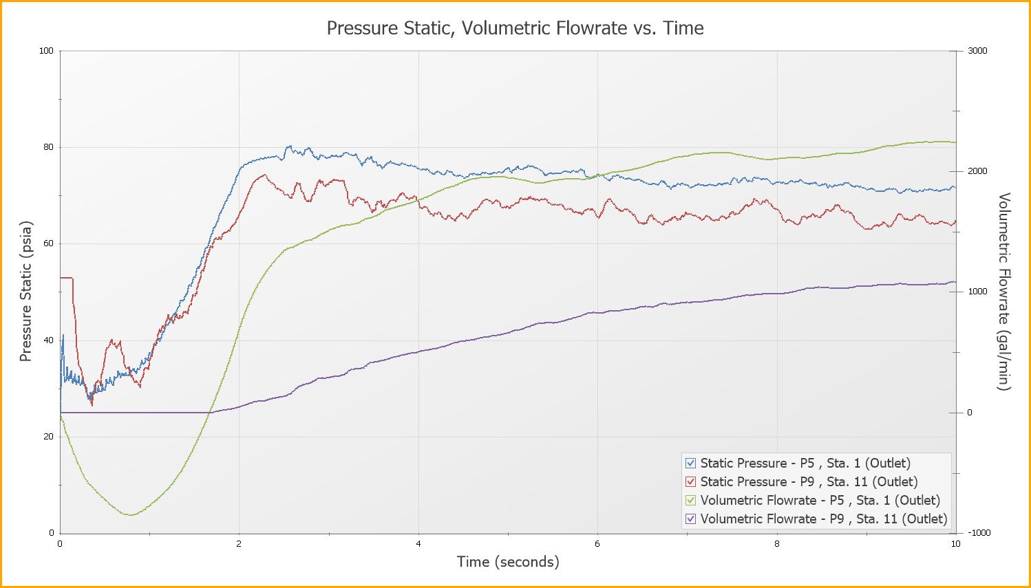
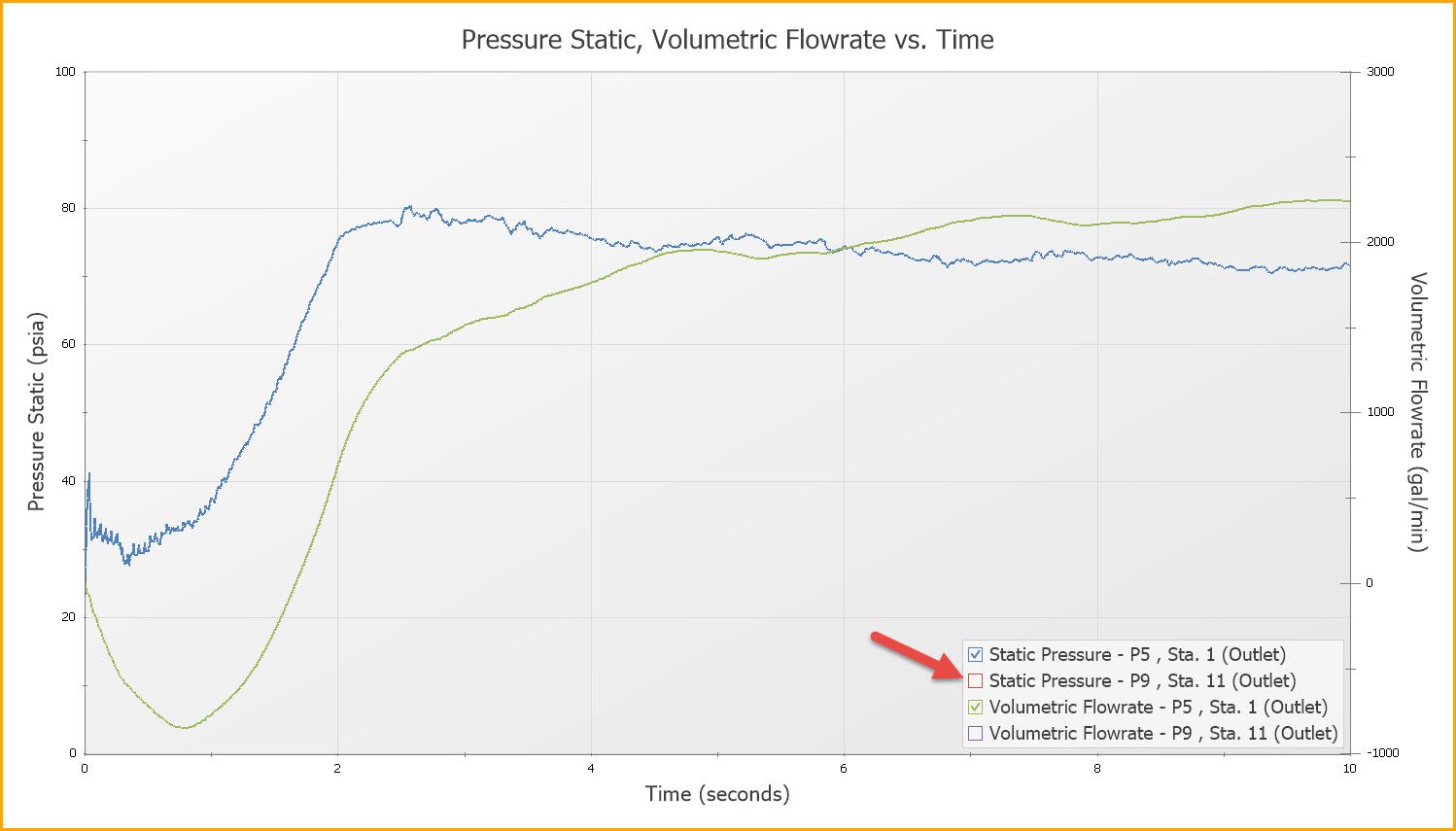
The graph can be formatted, printed, and added to the Graph List like other graphs - see my previous blogs about the details of how this is done. One thing I will point out here is the ability to quickly turn on and off the individual plot lines using the check boxes in the legend. In the graph above, we are showing the pressures and flows at both valves, which makes the graph fairly busy. To quickly see what is happening at just valve J6 (which is connected to pipe P5), we can hide the other lines. Uncheck the boxes in the legend next to the lines we want to hide. Now the graph is only showing what is happening at the valve we are interested in.
Same Parameter – Different Units
You can also use the Dual Y-Axis functionality to display the same parameter, but with different units. This can be very useful if both English and Metric units need to be shown. In order to do this, define the graph the same way as described above, but select the same parameter for the secondary axis and select different units. Below is an example of this, showing the pressure at the inlet of valve J6.
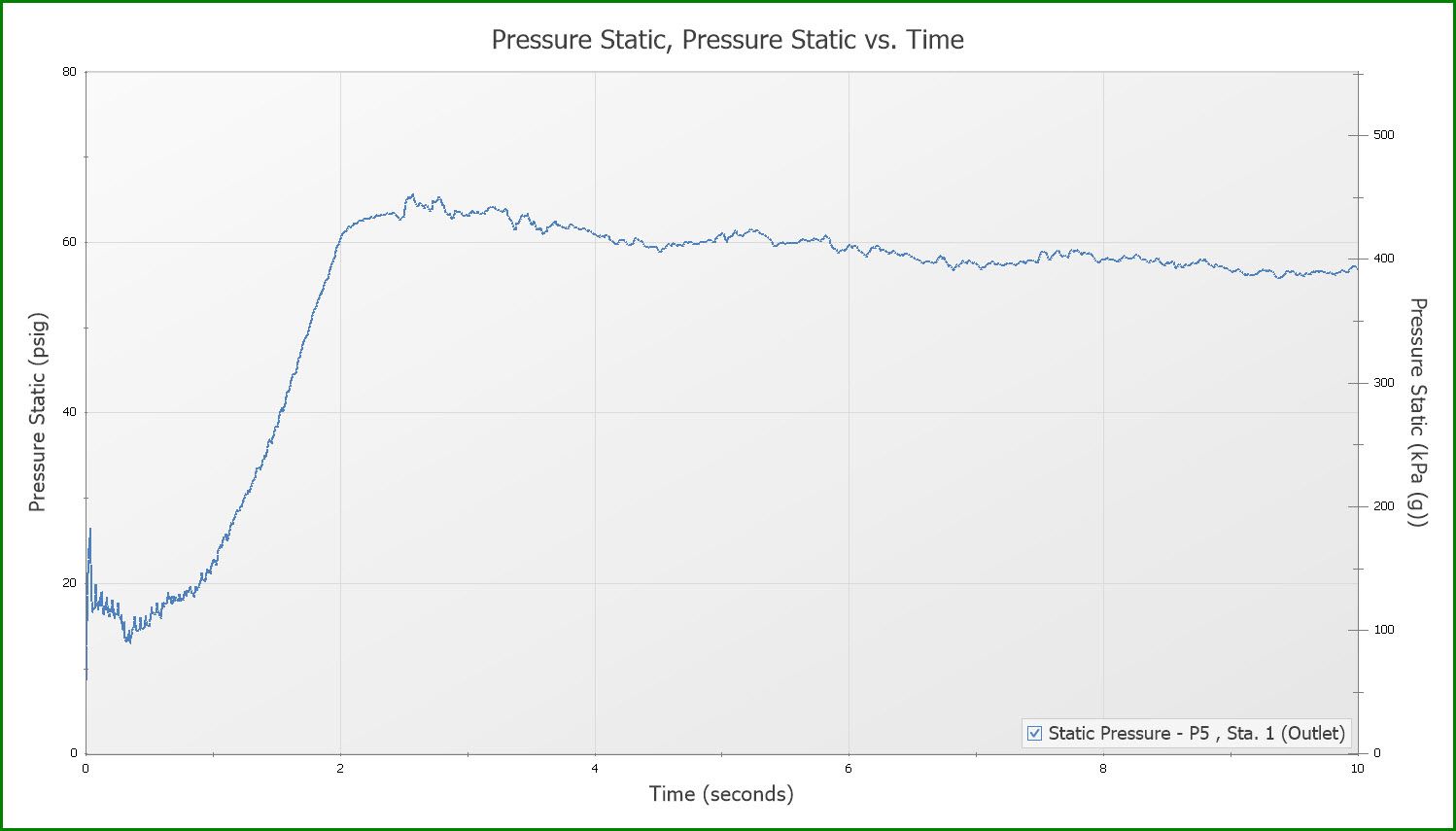
You can combine the Dual Y-Axis graphs and Stacked Graphs for sophisticated and professional-looking reports. The Graph Guide can help you through the necessary steps. These Dual Y-Axis options are under the Advanced tiles.
Until next time, keep exploring these graphing features. In the next few weeks we’ll talk about animations and how they allow you to visualize system behavior.
Addional Graph Guide information can be found here:
Now For Something Completely Different: The New Graph Guide in AFT Impulse 6


Comments