AFT Blog
The World in Motion - Understanding Results Through Animated Graphs
Previously, we talked about the Graph Guide and how to create Stacked Graphs and Dual-Y graphs. With AFT Impulse and with AFT Fathom’s XTS module, a great way to see how parameters change over time is through animated graphs.
For the purpose of continuity, I am going to again start with the AFT Impulse model, ‘Pump Startup With Event Transient.imp’, which is installed in the Examples folder, and use the ‘One Pump Start With One Running’ scenario.
In the previous blogs, we used a Stacked Graph and a Dual-Y Axis Graph to examine the pressures and flows at two valves (J6 and J9), which opened during the simulation. This time we will examine the pressure profile along two paths (“Supply Reservoir/Pump #1/Tank #1” and “Supply Reservoir/Pump #1/Tank #2”) and compare this over time to the valve CVs and Pump #2 speed.
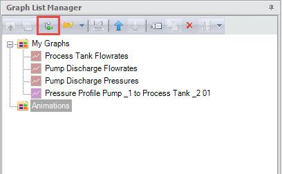
After running the model, go to the Graph Results window. Since we are going to want to see different types of graphs at the same time, we need to first create a graph folder to put them in. Click the New Folder icon in the Graph List Manager and name the folder ‘Animations’.
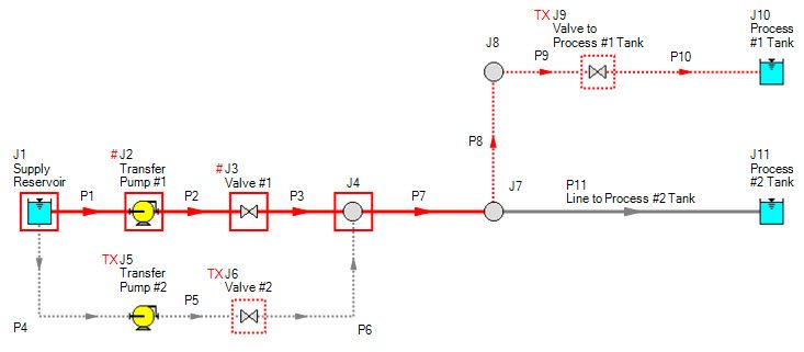
The first graph we need is a Profile along the path from the Supply Reservoir, through Transfer Pump #1 (J2) and up to Process #1 Tank (J10). There are several ways to select these pipes. For example, you could just select in the list of pipes. However, it may be easier to select the pipes on the Workspace, which will then pre-select them in the Profile plot pipe list. Click and drag the cursor to select some pipes, then hold the Shift key to select (or deselect) other pipes leading to junction J10. If you would like to, you can make this into a group for later use by selecting Groups from the Edit menu and clicking Create.
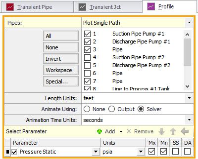
Once the pipes are selected on the Workspace, we are ready to define the graph. In the Graph Control, select the Profile graph type tab. Notice that the pipes are selected. Verify that the parameter is ‘Pressure Static’ and the units are correct. The Maximum (Mx) and Minimum (Mn) check boxes are checked so we can see the envelope of the pressure along the path.
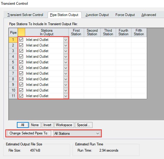
Now we need to select how to animate the pressure. Between the pipes selection and the parameters, you will see ‘Animate Using:’ None will obviously not show any animation. Output will use the data saved in the .out file when the model is run. This option is only available if ALL Stations was selected in the Transient Control for the pipes. By default, Inlet and Outlet Only is selected, so you may need to change them if you want to use the Output.
However, for our purposes here, we can use the final option: Solver. This will run the calculations through AFT Impulse’s solver engine to calculate the properties. After clicking Generate, you will see the Play, Record, Stop and Pause buttons at the top of the graph. Click Play and you will see the pressure profile change over time as the second pump starts and then again when the valve to Process #1 Tank opens.
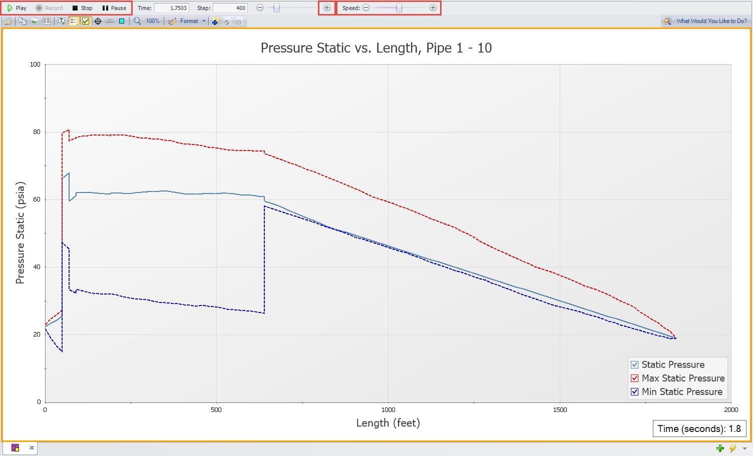
You can change the speed using the slider on the right. You can also pause the animation to examine the profile. Since we are using the Solver to generate the animation, we can only click the ‘+’ button to take steps forward. If the Output method was used, we could also go backward and use the time slider to select a time step of interest.
Notice that the time is displayed in a box at the bottom. This can be moved around as desired. By right-clicking on the box, you can change the number of digits shown and the font.
Now that we have the first graph made, we need to add it to the Graph List. First, select the ‘Animations’ Graph Folder, then click the icon on the graph toolbar with the blue plus sign with the folder. Give the graph a name and it will be listed under the Animations folder in the Graph List.
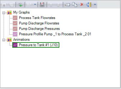
Now we need to create the second graph, which will be the flow path from the Supply Reservoir through Transfer Pump #1 (J2) and up to Process #2 Tank (J11). Using the same process as above, we can select the pipes on the workspace. Again, use the Profile graph type and animate the Pressure Static using the Solver. Add the graph to the graph list in the Animations folder.
The final two graphs are Transient Junction type plots. Create a new graph tab by clicking on the green ‘+’ at the bottom of the graph area and then click on the Transient Jct tab. We first want to see the CVs for the valves J6 and J9. Click on each of these and add them to the list. The default parameter is Cv so just click Generate. Add the graph to the graph list in the Animations folder.
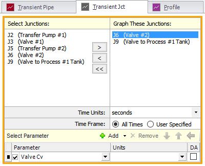
Do the same thing for the pump J5 and show the pump speed. Add the graph to the graph list in the Animations folder.
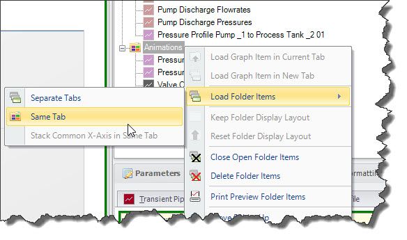
Now that we have the four graphs listed under the Animations folder, we can put them all together on one tab. Right-click on the folder name and select ‘Load Folder Items’ and then ‘Same Tab’.
The four graphs will now be tiled together. You can adjust the size by dragging the separation borders around. I have also changed the font and locations of the legends so that they are not overlapping the plot lines. Now is the main point of this blog – we can animate these all at the same time. If you click the Play button, you will notice the top two graphs will animate the pressures over time, while the bottom two will have a vertical red line showing the time location on their data. You can now see that the pressure in the line leading to Tank #1 doesn’t start rising until the valve J9 begins to open. Furthermore, this occurs before the pump J2 reaches full speed and the valve J6 is fully open.
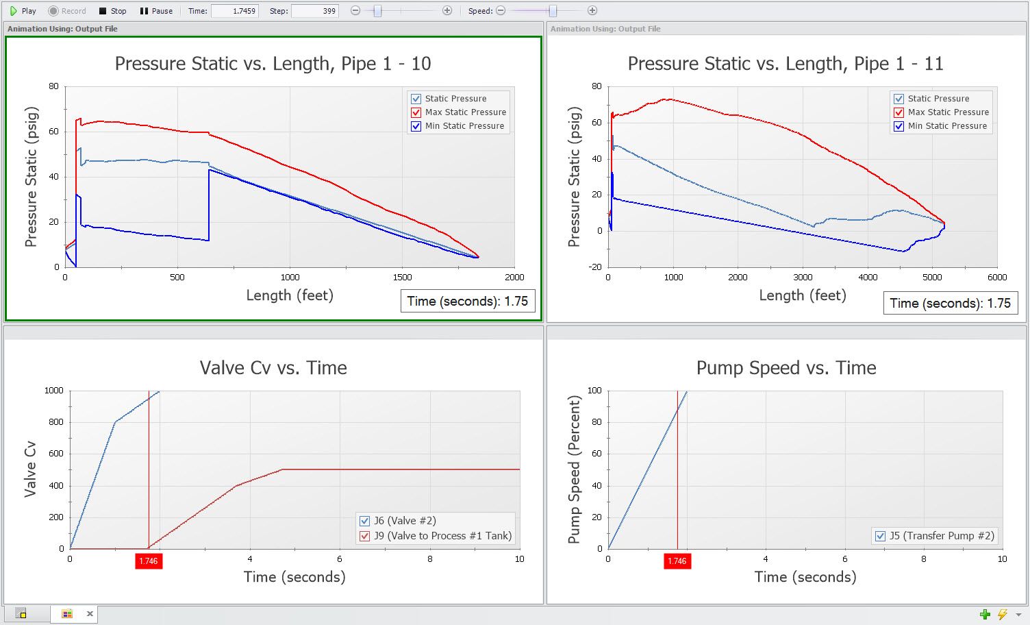
You can change the order of the graphs within the Graph Folder by selecting the graph item and either dragging it, or clicking on the blue up and down arrows. This will change the order in which the graphs are tiled.
You can also grab the top bar of the graph and drag the tile around. You can dock it by dropping it on the blue docking region squares. It will also highlight where it is going to be placed.
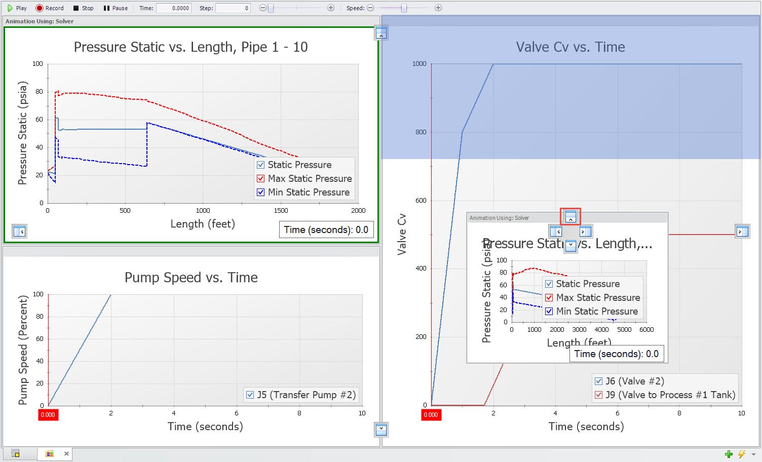
There are many applications of this multi-animation graphing feature. As you develop your models, you can look for ways to use this capability. Next time we’ll talk about formatting and getting graphs to look exactly the way you want them to.
Addional Graph Guide information can be found here:
Now For Something Completely Different: The New Graph Guide in AFT Impulse 6
What Would You Like to Do? – Exploring the New Graph Guide



Comments