AFT Blog
What Good is a Map Without Colors?
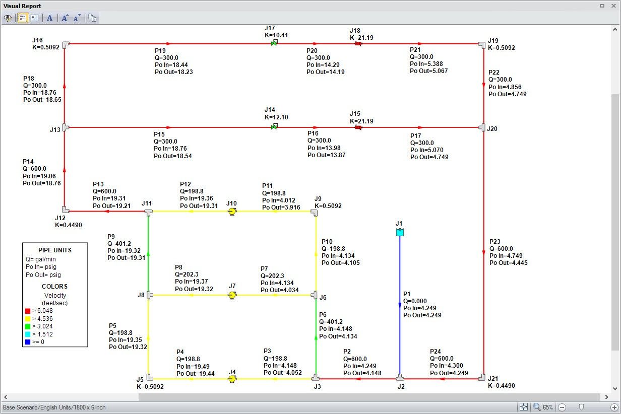
Each AFT software product employs five Primary Window tabs in which you would build, define, and analyze the model of your system. Of these, the Visual Report window is incredibly useful in that you are able to overlay your model input or output parameters directly on top of the graphical layout of the system itself. This is an excellent feature to use when you want to provide the bottom line results to clients and colleagues at a high level (or a detailed level). Figure 1 is an example of what the Visual Report for a particular system might look like. As shown, the volumetric flow rate and inlet/outlet stagnation pressures as well as junction loss factors are displayed on the Visual Report.
Figure 1 - The Visual Report window of AFT Fathom. Volumetric flow rates and inlet/outlet stagnation pressures displayed for pipes. Loss factors displayed for junctions.
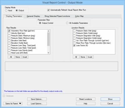
The Visual Report window is customizable in many ways by using the Visual Report Control window shown in Figure 2 which can be accessed from the Tools menu. There are many other formatting features available in the Visual Report Control window as well so you can customize the Visual Report to your liking.
Figure 2 - The Visual Report Control window allows you to configure which input or output results that are displayed in the Visual Report.
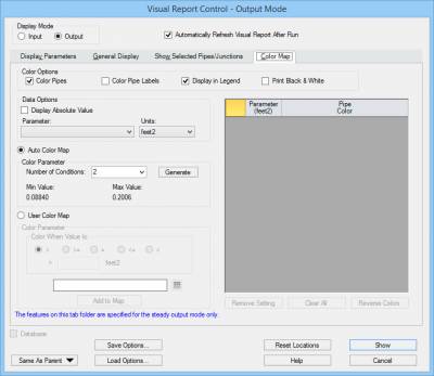
Beyond simply displaying the results themselves, you can also color-code all of your pipes according to a specific output parameter so that you can easily see what range of values that particular output parameter lies within. This capability is called the "Color Map" feature and can be configured on the Color Map tab of the Visual Report Control window. Figure 3 shows the Color Map tab before it has been defined.
Figure 3 - A blank Color Map tab canvas within the Visual Report Control window.
The process to setup the color map is relatively straight-forward and quite easy. And now, with AFT Fathom 9, and soon with AFT Arrow 6 and AFT Impulse 6, you can take advantage of the new automated color mapping capability making the process even easier!
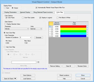
First, you would specify the Parameter you would like to color-code on the Visual Report. You would also choose the associated units as well. Here's where the incredibly useful new AFT Fathom 9 automated color-mapping feature comes into play! You would choose the "Auto Color Map" option, and then specify how many conditions you would like to have between your minimum and maximum values and then let Fathom generate the colors for you.
Figure 4 shows an example of using the Auto Color Map feature for pipe velocity and separates the minimum and maximum velocities into five separate velocity ranges and the Pipe Colors are automatically chosen.
Figure 4 - Using the Auto Color Map feature to separate five ranges of pipe velocities.
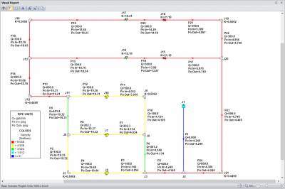
Finally, once you show this in the Visual Report, your layout will contain a significant amount of rich information in a very easy to read format. Figure 5 shows the final layout for pipe flow rates and pressures, junction loss factors, and the pipes are colored according to the range of velocities with the Color Map.
Figure 5 - All pipes in the Visual Report colored according to ranges of pipe velocities.
Overall, this is useful feature that you may find yourself using quite often. Again, what good is a map without colors, right??!


Comments