Pump vs. system curves provide an intuitive, graphic way to understand how a pump interacts with a piping system. These can be useful during pump sizing, but can also be informative when your pump must function in a variety of operating conditions. Understanding how changes to your pump or system affect your operating point can be invaluable during design and troubleshooting. These different scenarios, and their subsequent impact on flowrate, can be best visualized using Multi-Scenario Pump vs System curves
If you aren't familiar (or completely comfortable) with pump vs. system curves, we have an ongoing blog series all about them! You can find Part 1 and Part 2A on our website. Be sure to keep an eye out for Part 2B on the way.
Today, we will be over-viewing a new feature in AFT Fathom 11, Multi-Scenario Pump vs. System curves. This new feature combines the power of scenarios (each detailing a potential operating condition) with AFT Fathom's existing pump vs. system graphing capabilities to provide a more instinctive understanding of your overall system.
Examining multiple pump/system scenarios can be very useful for
- Comparing operating scenarios to ensure the pump always operates in the Preferred Operating Region of BEP
- Exploring the sensitivity of a system to changes such as valve closure
- Determining how a valve's characteristic curve impacts flowrate at different open percentages
- Sizing up your different pump options during sizing
How to create Multi-Scenario Pump vs. System Curves
There are two ways to generate a multi-scenario pump vs. system curve graph:
- Standard Method – Generate individual graphs for different scenarios and overlay them in one graph.
- Batch Run Method – Create a graph template, then use a batch run to automatically generate curves for all scenarios of interest.
The Standard Method
Beginning with the Standard Method, there are 5 core steps to create a multi-scenario graph:
- Create a Multi-Scenario Pump vs. System Folder
- Generate a Pump vs. System Curve for your first scenario
- Add the Scenario-Specific Curve to the Multi-Scenario folder
- Repeat for all other Scenarios of Interest
- Generate your Multi-Scenario Graph
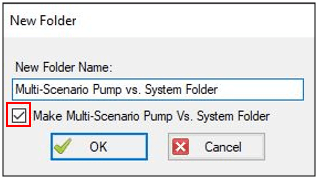
Creating a Multi-Scenario folder begins in the Graph List Manager on the right of the Graph Results tab. In the Manager, select "New Folder", give it a name, and check the box to "Make Multi-Scenario Pump Vs. System Folder". This is the central folder we will save our individual scenario curves to.
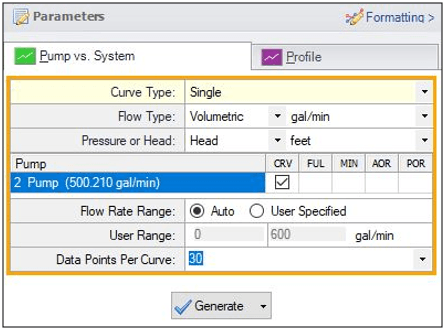
The second step is to generate a pump vs. system curve for the first scenario of interest. This requires output from the model, so ensure your model has been run. Then, on the Graph Results window, use the Generate button. The Parameter section is where you can make individual adjustments to each scenario's curve, varying the flow rate range of the curve for example. There are also new options in Fathom 11 to include parameters such as the pump's Preferred Operating Region and Allowable Operating Range. For a variable speed pump, you can also display the pump's Full Speed and Minimum Speed pump curves on the same plot. Add these to your plot with the checkbox after specifying these parameters in the pump junction itself.
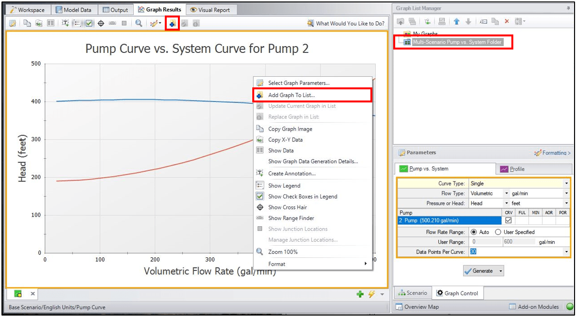
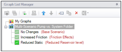
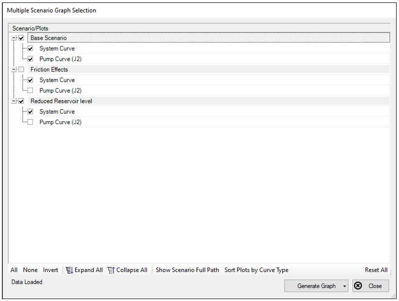
With our relevant scenario graphs generated and added to our folder, we can right click our Multi-Scenario folder and choose "Load Multi-Scenario Graph". This presents the Multiple Scenario Graph Selection tool, allowing you to specify which pump/system curves from each scenario you want represented in your final graph. In our case, we will look at the same pump in a variety of operating conditions. Since the pump curve does not change in our different scenarios, we will only show the pump curve from the base scenario rather than every scenario.
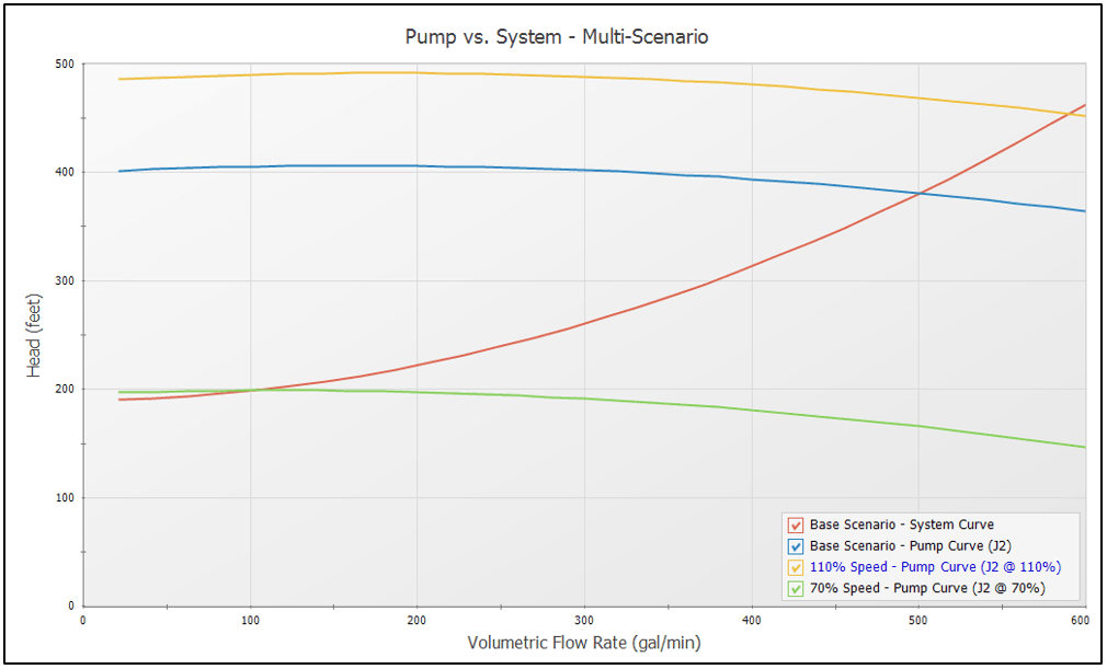
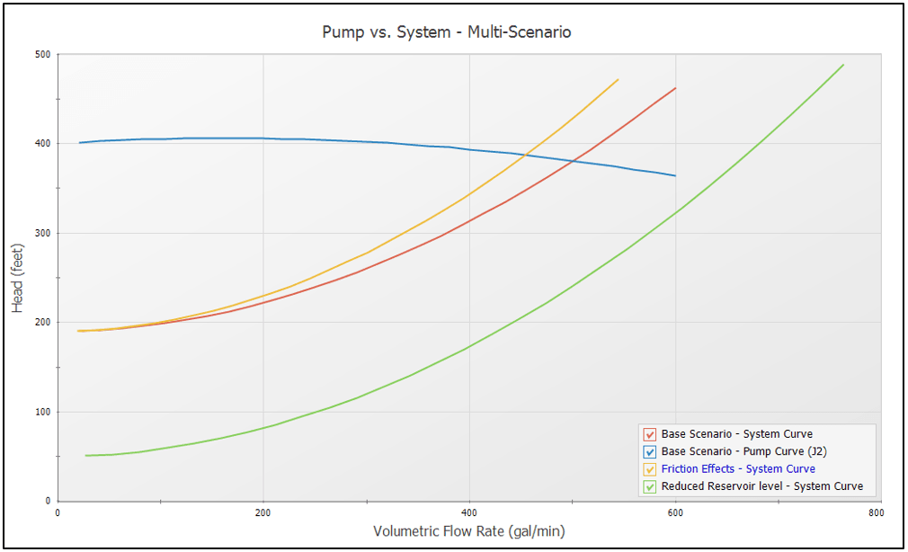
Now that our graph is fully defined, we can use the Generate Graph button to create our Multi-Scenario Pump vs. System curve. Below we can see how the slope of the system curve increased due to increased friction, while the change in static pressure shifted the system curve vertically. This plot provides a convenient checkbox for each scenario's curve to simplify the graph and isolate scenarios during analysis.
Note there are some limitations with this Standard Method. For example, updating a scenario's parameters will not update the curve in the Multi-Scenario folder. Each graph added is a snapshot of the system when the graph was added to the folder. Loading these saved items from the Graph List Manager will also load the snapshot, which is not necessarily the system in its current state.
The Batch Method
The Batch Run method is great if you do not need to manually adjust each scenario's pump system curve parameters. Instead, the Batch Run method relies on a user created template to automatically generate the different scenario's pump vs. system curves. This template is a pump and system curve generated for one scenario, but this time saved as a standard Graph List item rather than in a Multi-Scenario folder. Note, however, that this template is pump specific, so make sure the pump is common to all the scenarios you wish to graph.
With your template saved, you can then launch the Batch Run window found via File>Start Batch Run... In the bottom right you will see a check box indicating if a Multi-Scenario graph is to be created, and which Graph List item acts as the template. For this example, rather than looking at changes in the system, our scenarios vary the pump's speed. These scenarios were added to the batch run with the "Add Scenario" button near the top left.
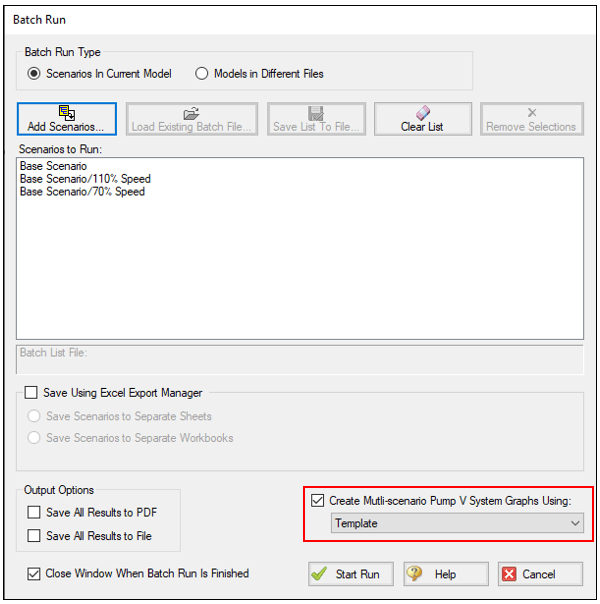
After starting your batch run, a new Multi-Scenario Pump vs. System Folder is automatically created and time-stamped with the run. The time stamp can come in handy if you make adjustments to your scenarios after creating your graph and need to create another set.
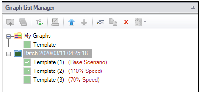
The final step is to "Load Multi-Scenario Graph" as before, allowing you to specify which pump and system curves to show. In this case, I left the system curve consistent while including each scenario's pump curve. This is an easy way to see what range of flow rates a variable speed pump can provide.